
Designing trust infrastructure for a marketplace that has to convince Nigerian sellers and buyers to leave WhatsApp.
I design trust infrastructure for markets that don't have any — where the challenge isn't a prettier screen, but persuading someone to change how they already make a living.
Millions of Nigerian businesses run on WhatsApp. It was never built for them.
AbujaMarkt is a two-sided marketplace designed to replace the informal WhatsApp commerce that dominates Nigerian small-business trade. But the problem isn't that WhatsApp is bad — it's that it's good at the wrong things.
WhatsApp gives Nigerian sellers speed, familiarity, and a direct line to their customers. What it doesn't give them is structure. Orders live in chat history. Payments are bank transfers with no escrow, no refund path, no record. Buyers have no way to verify whether a seller is real. Sellers have no way to prove their business to a bank, a new customer, or anyone outside their existing contact list.
The result is a fragile system. Buyers get scammed. Sellers lose customers they can't trace. Money disappears into chat threads. And the informal economy that should be the engine of Nigerian commerce has no infrastructure underneath it.
AbujaMarkt's thesis: if you give Nigerian sellers and buyers the same speed and familiarity they already have on WhatsApp, but add escrow, verified identities, structured orders, and a public storefront on top — they'll switch. Not because the app is prettier, but because it makes them materially more credible, more protected, and more in control of their business.
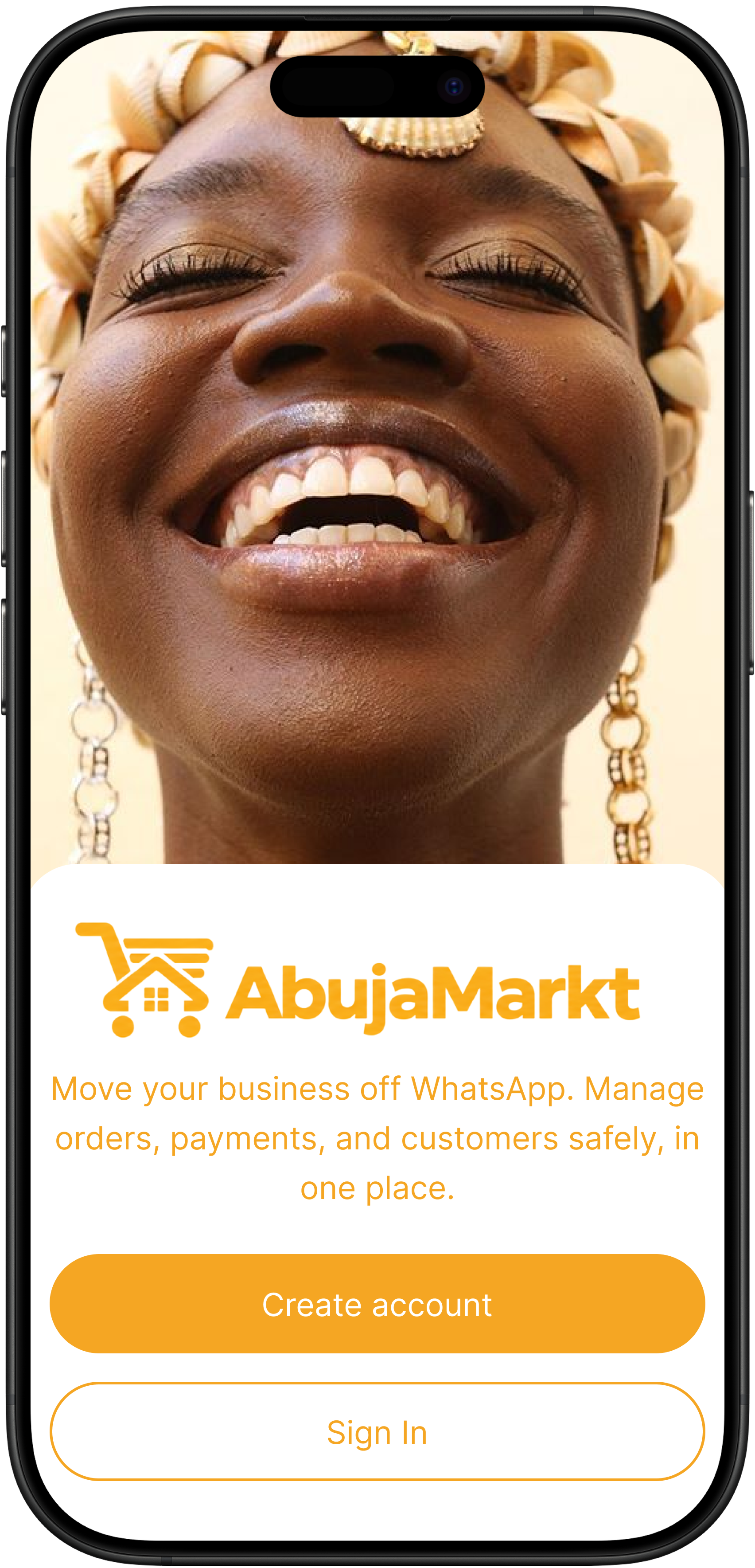
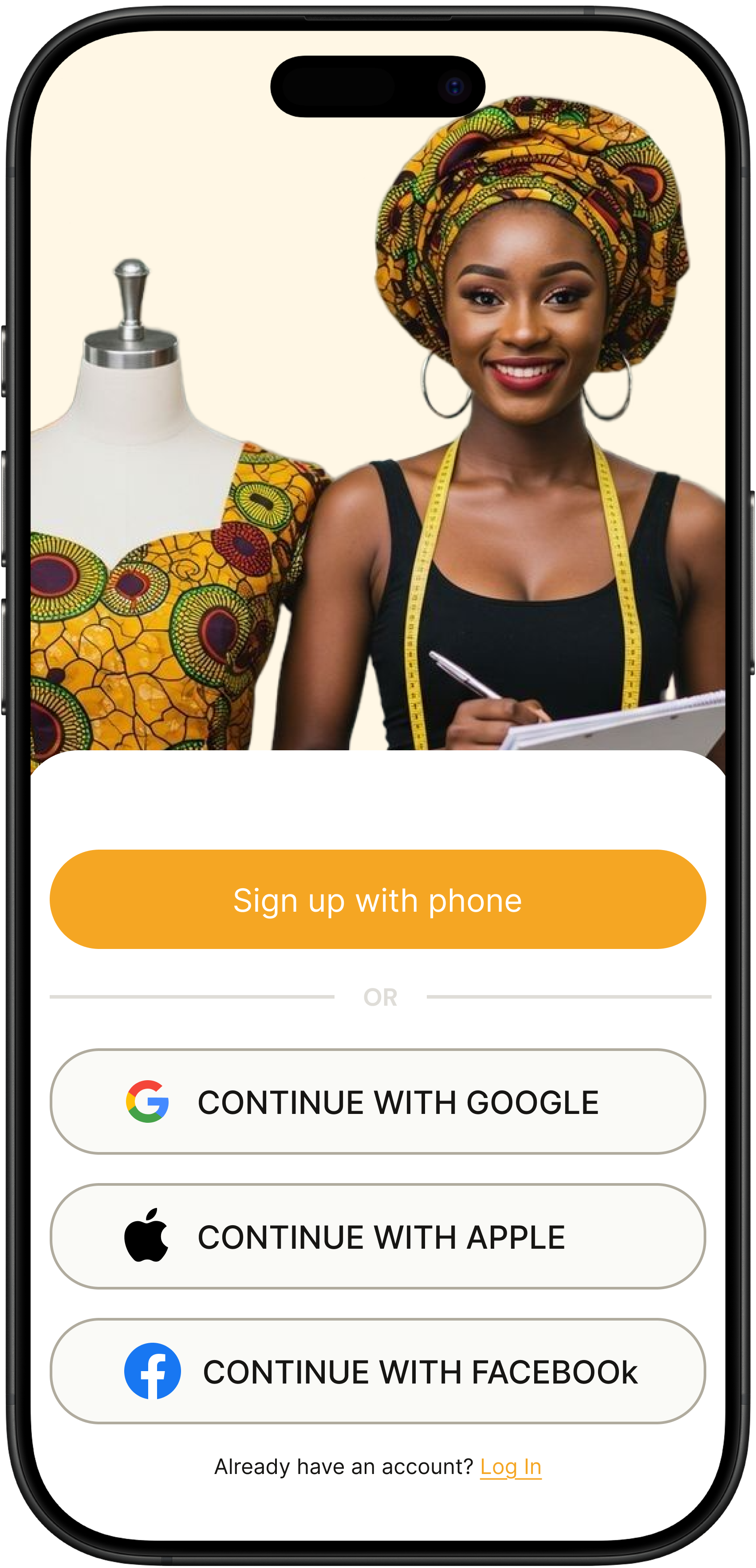
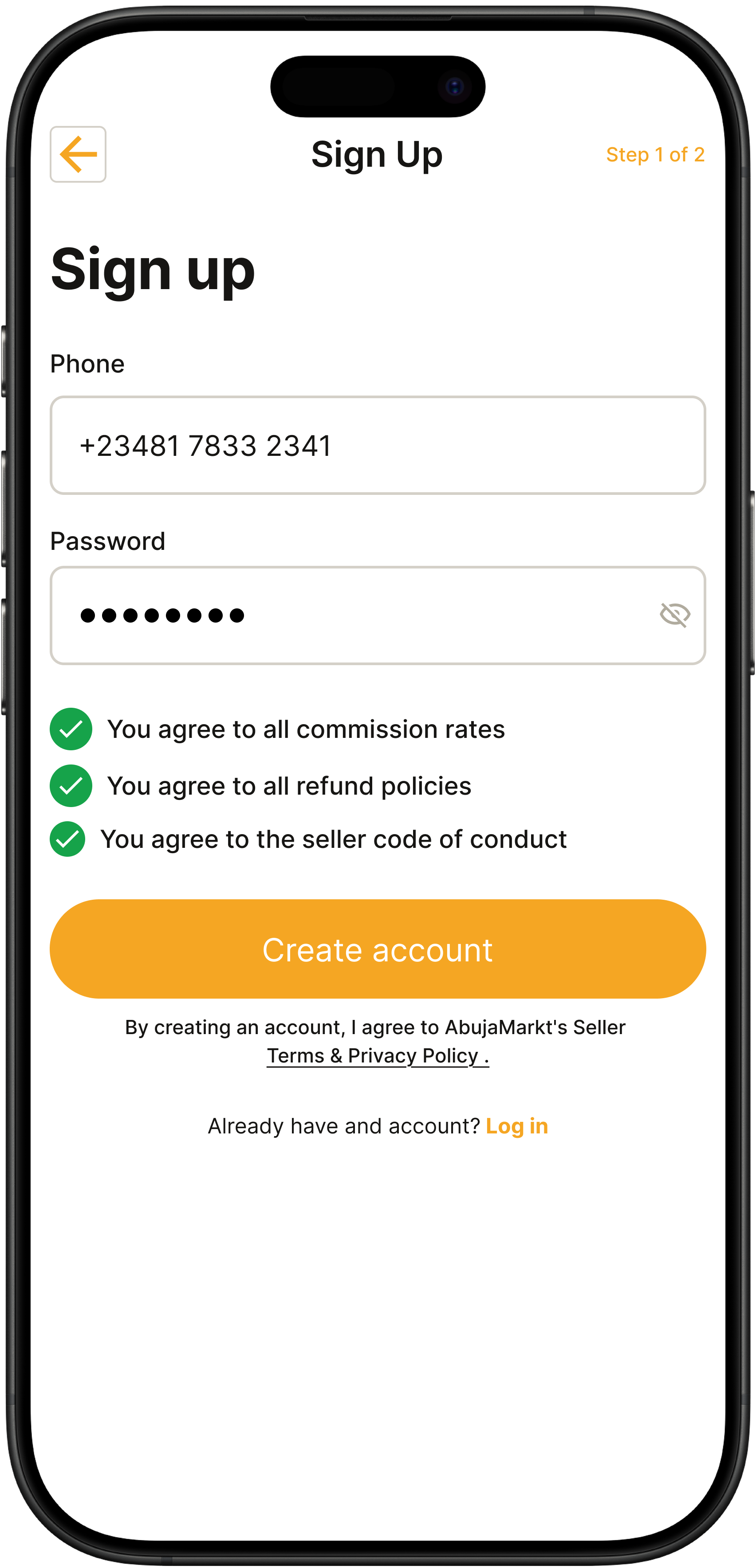
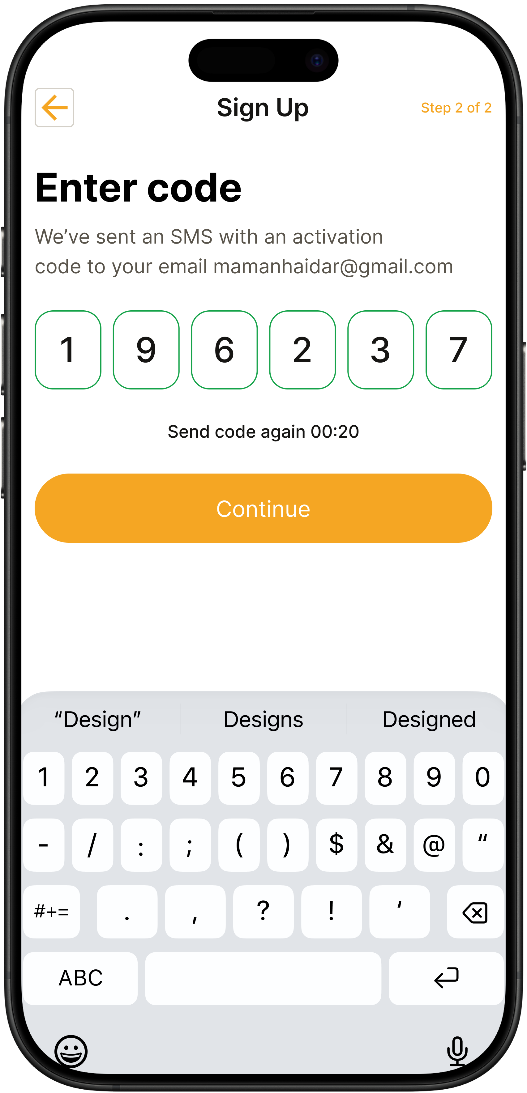
Selected screens from the final design.
A quick look at the end state before diving into the decisions behind it. Every screen was designed against the same question: does this make it easier for a Nigerian seller or buyer to leave WhatsApp?
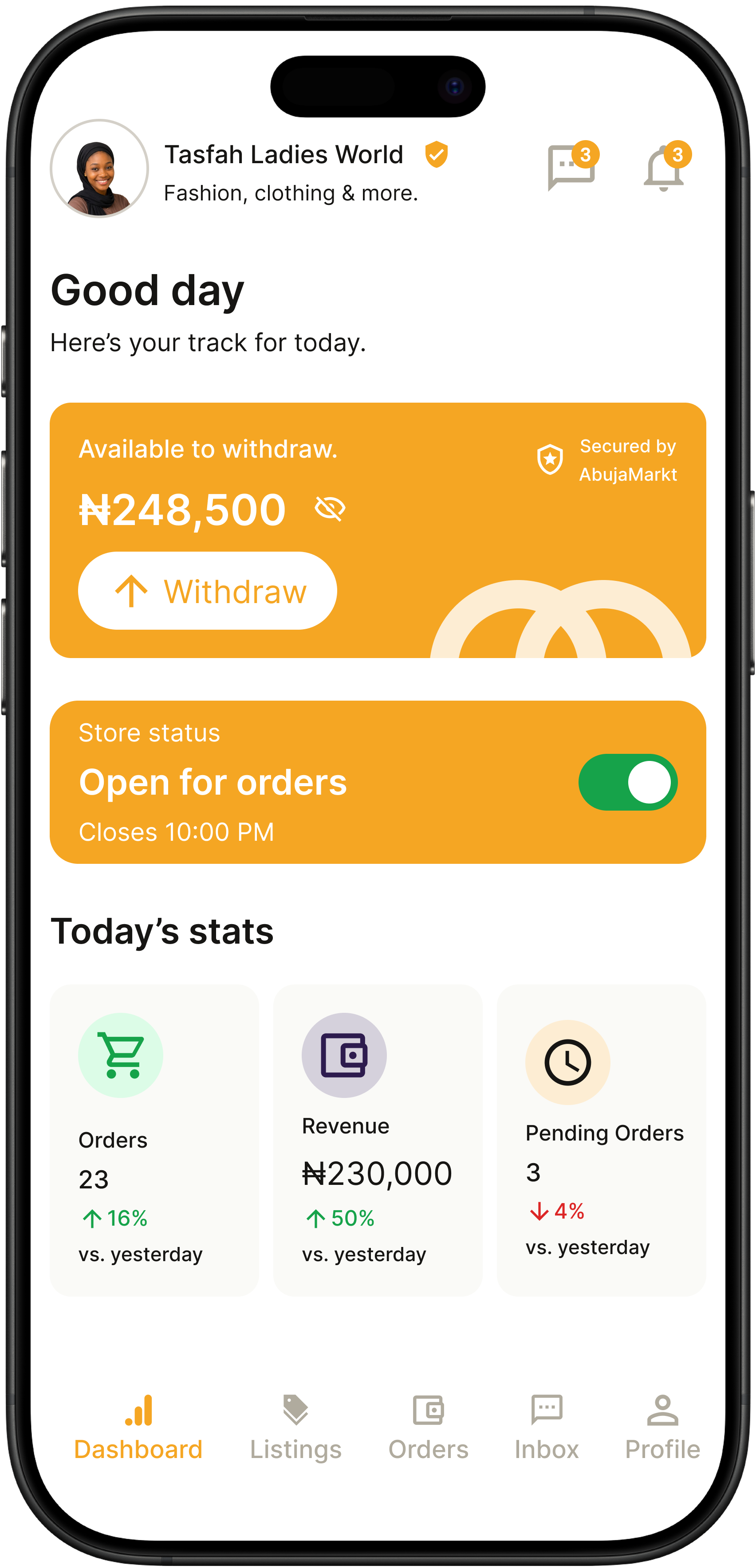
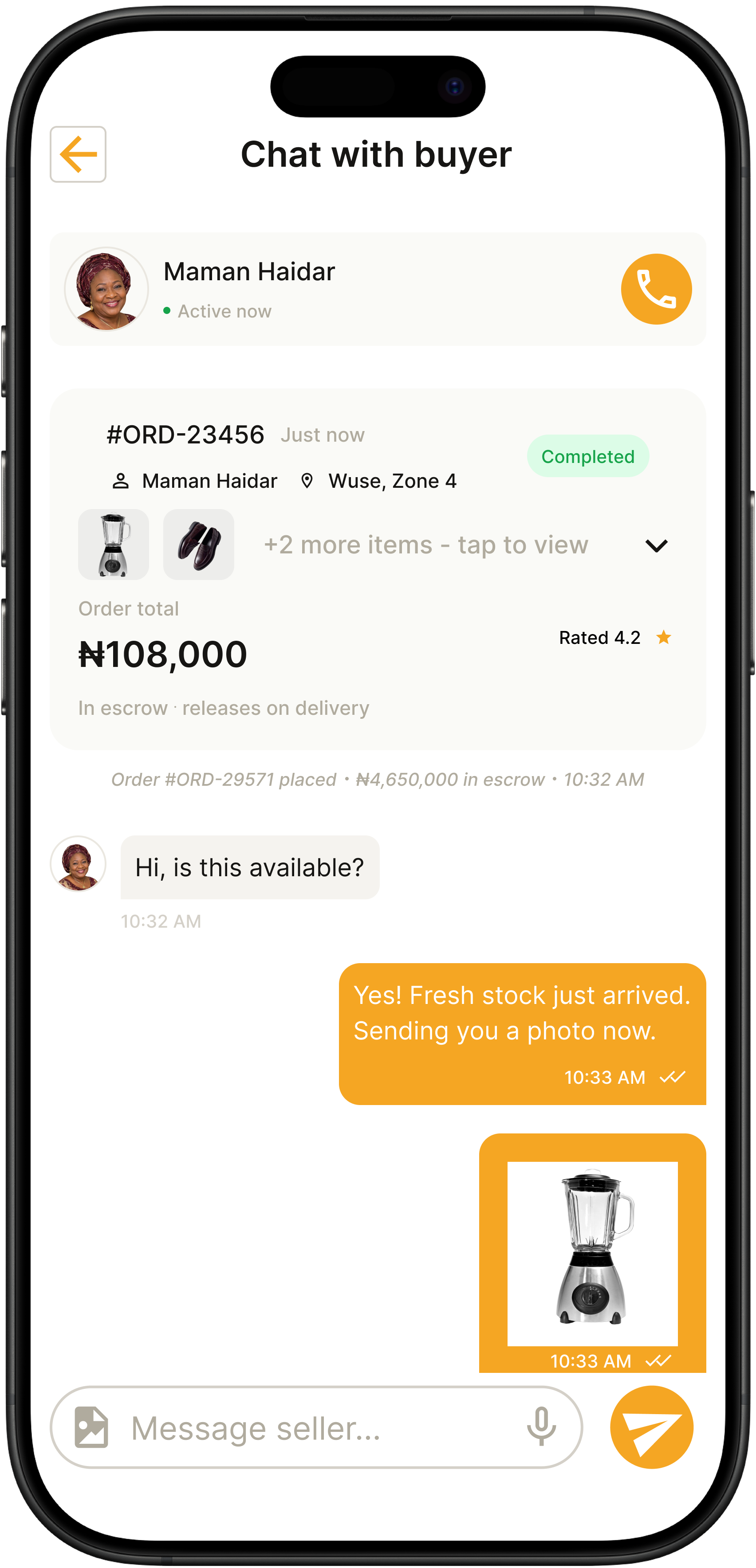
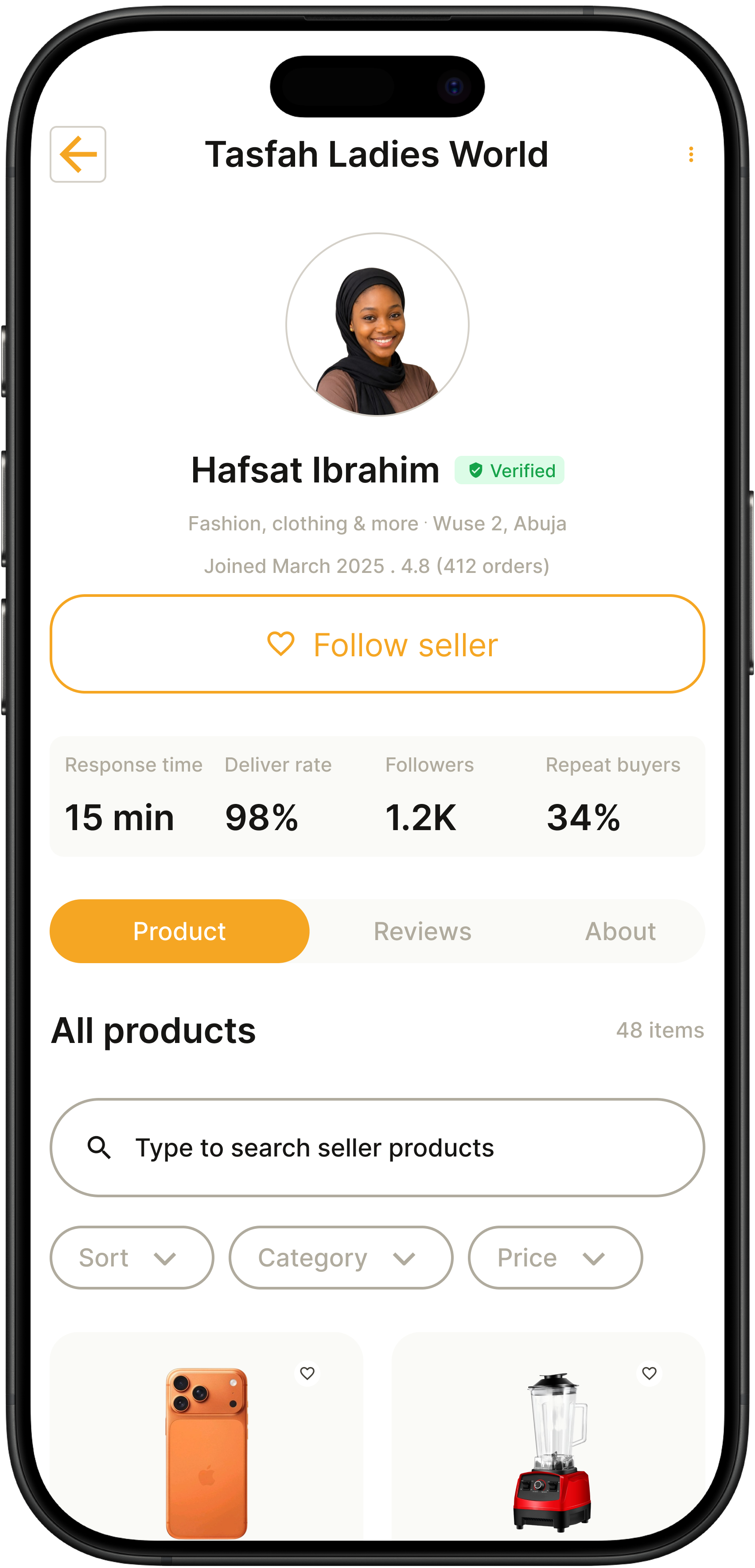
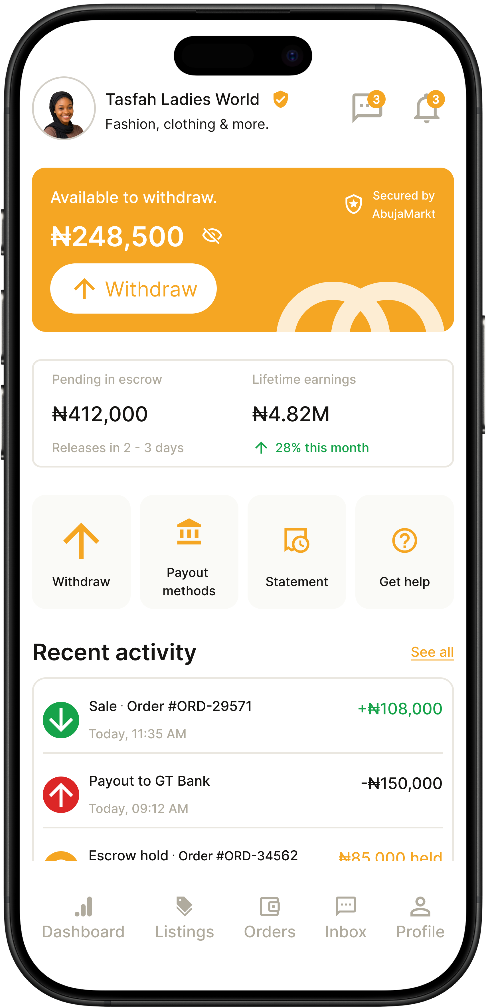
The full set of screens.
Twenty key screens from across the app — buyer and seller sides, success and error states, core flows and edge cases. Swipe or use the arrows to browse.
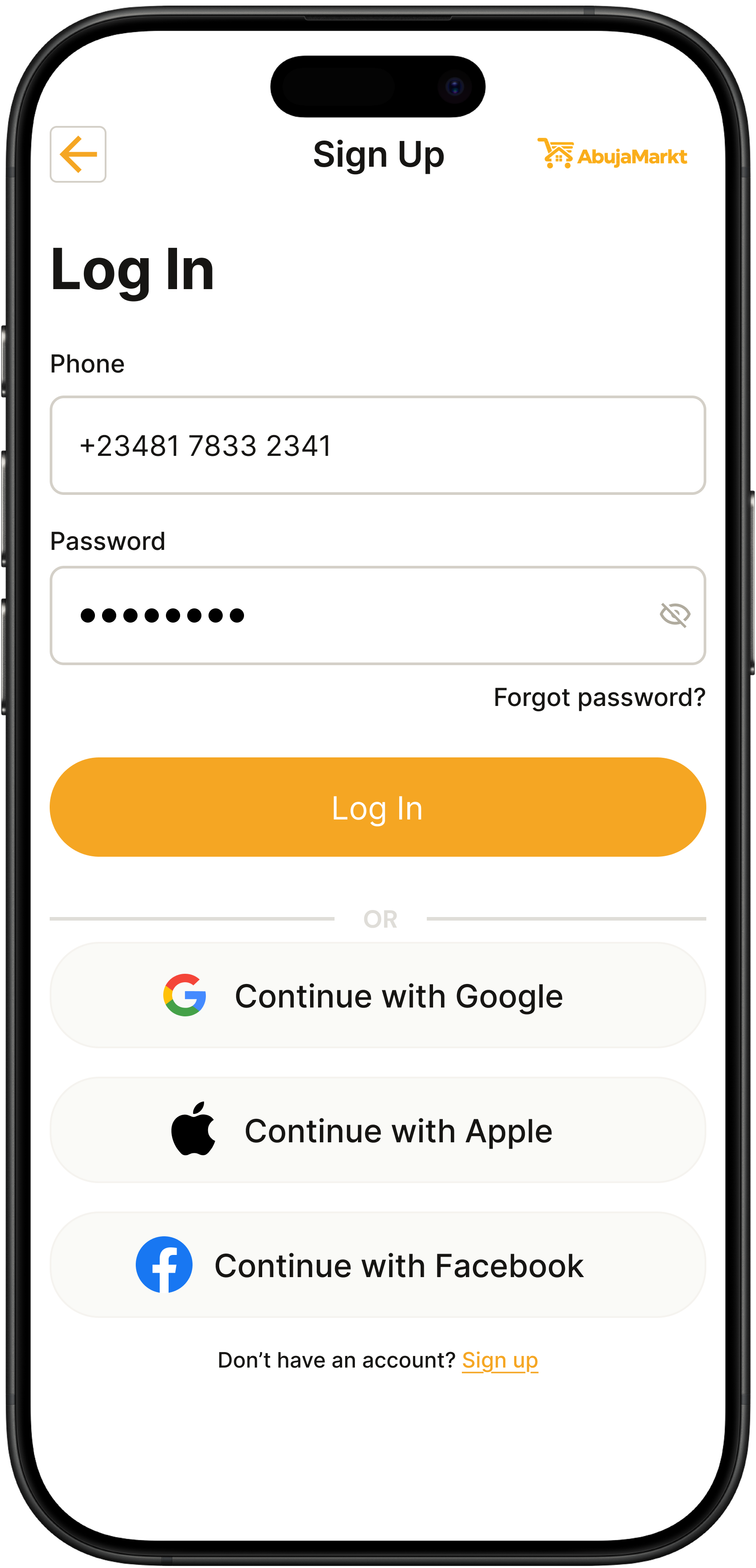
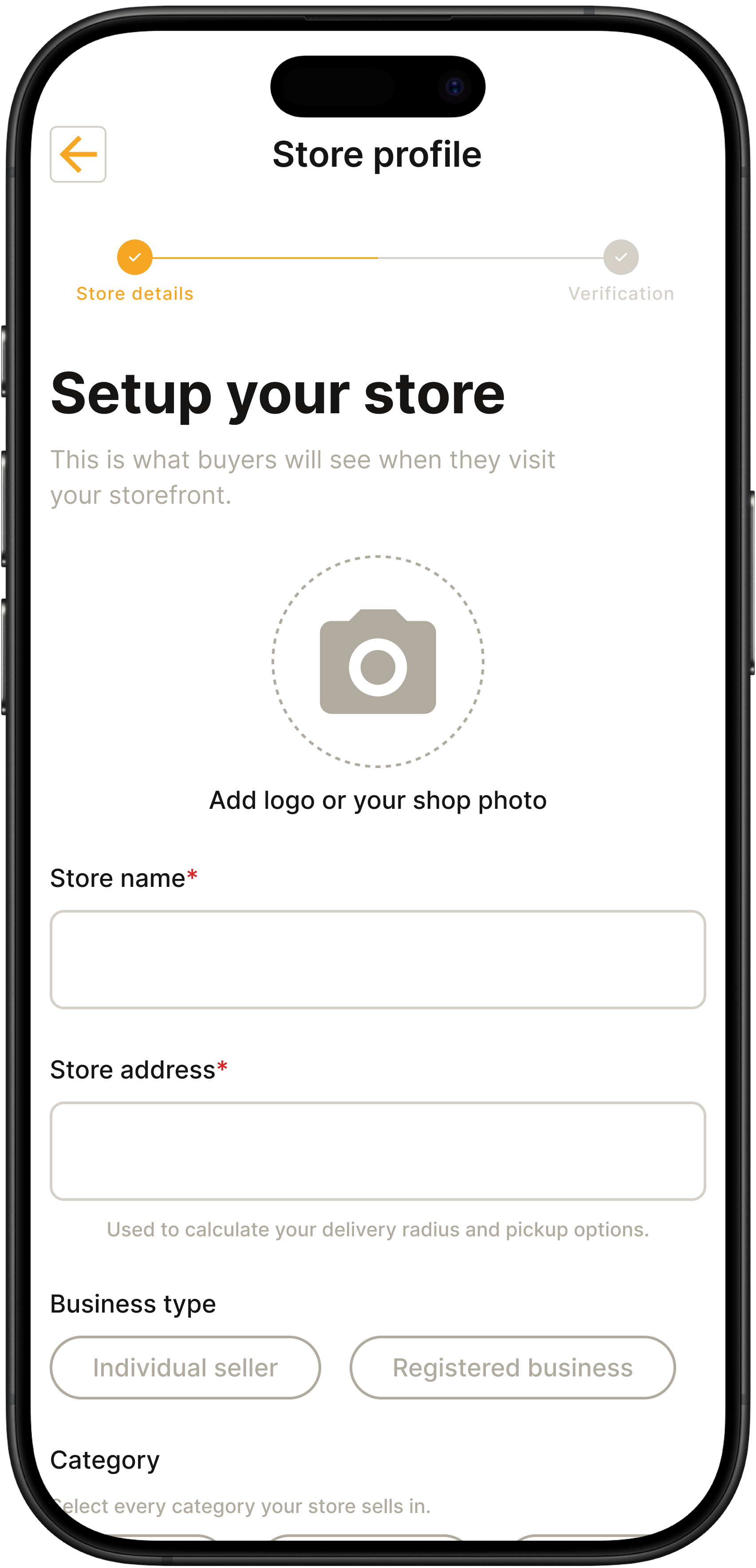
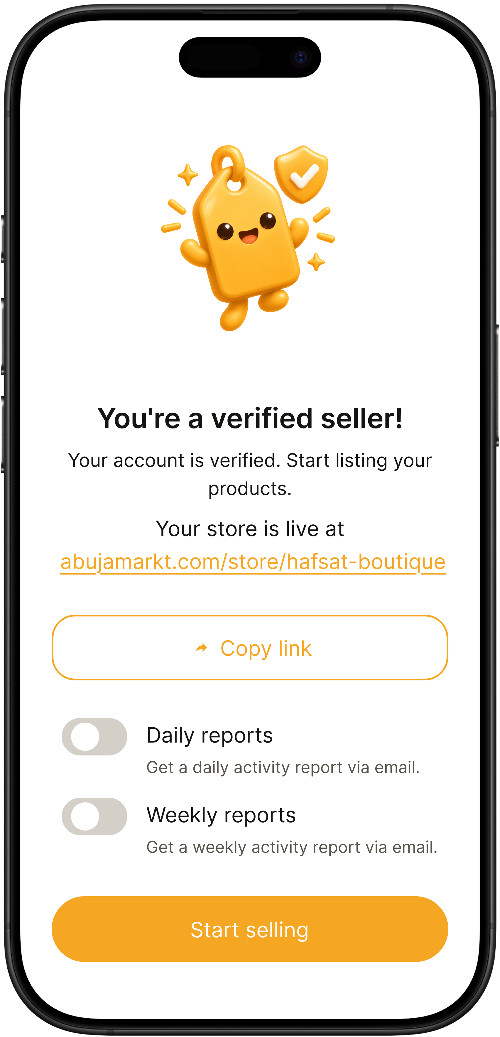
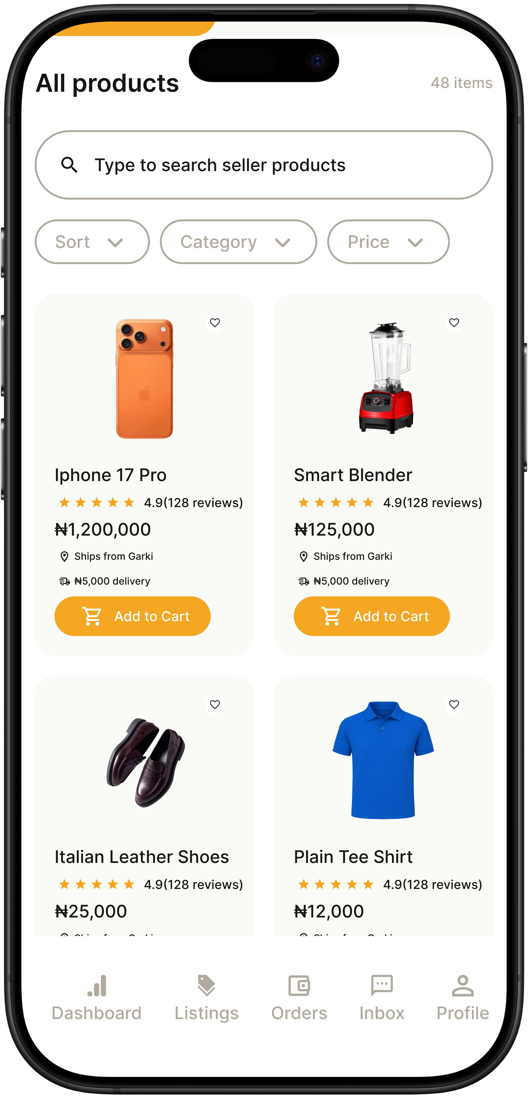
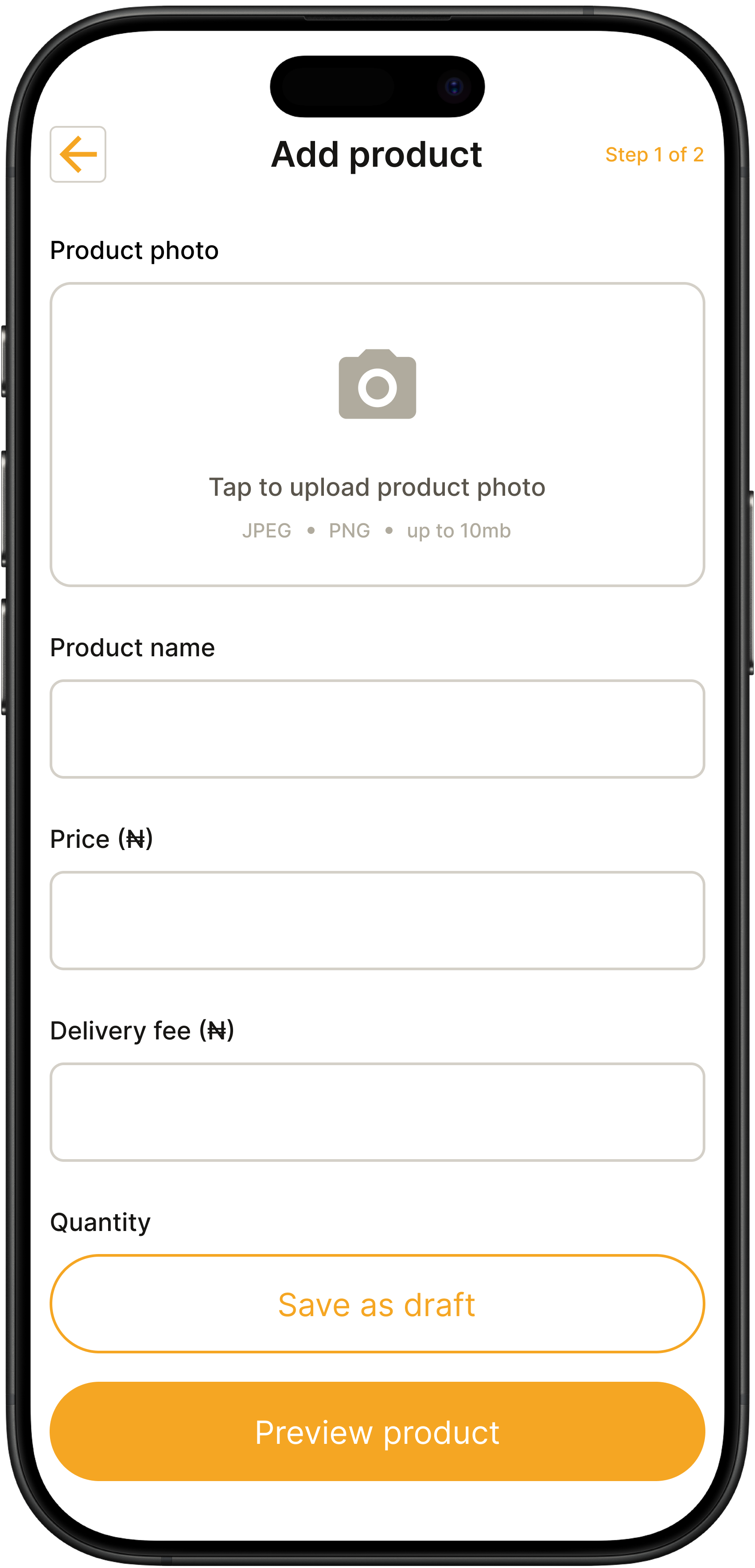
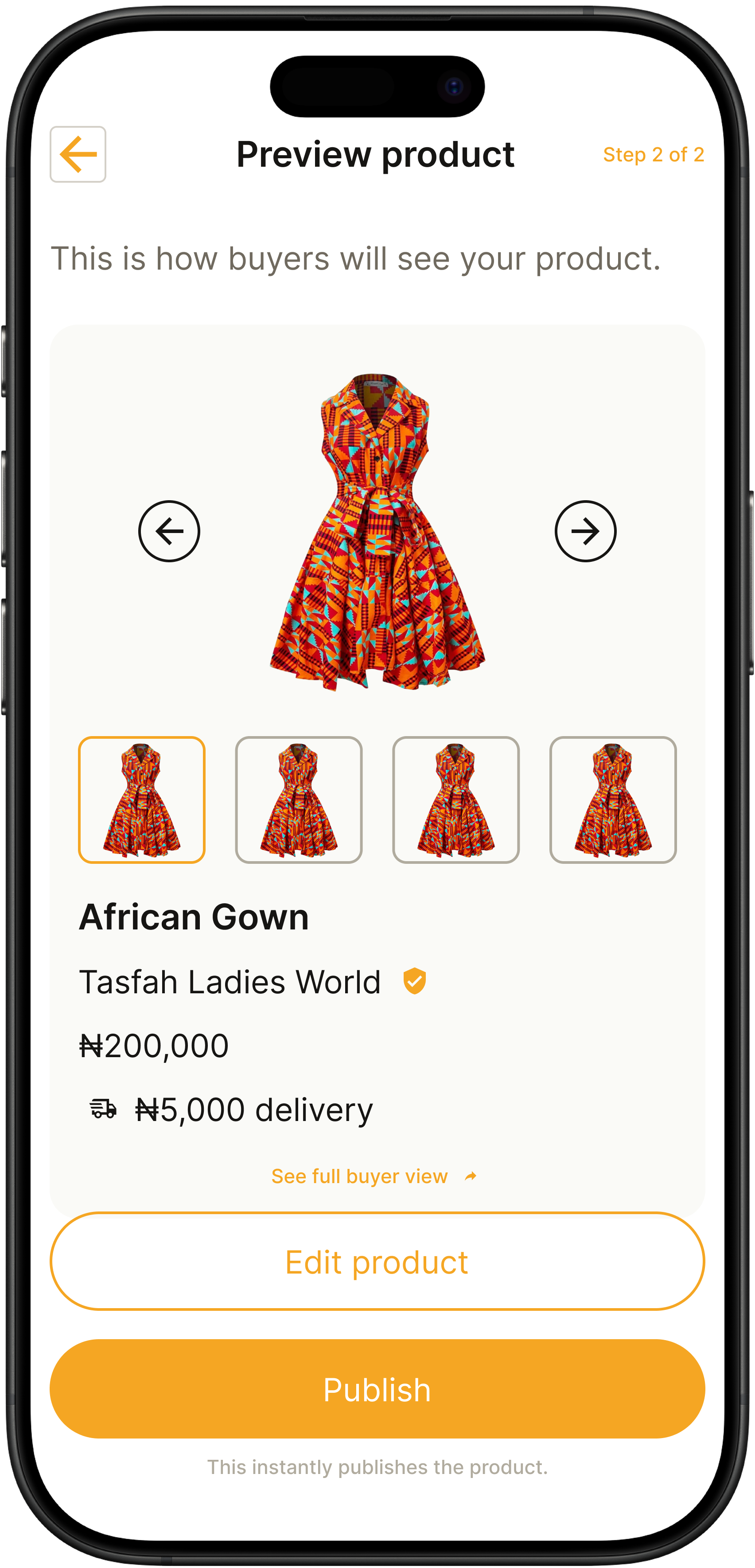
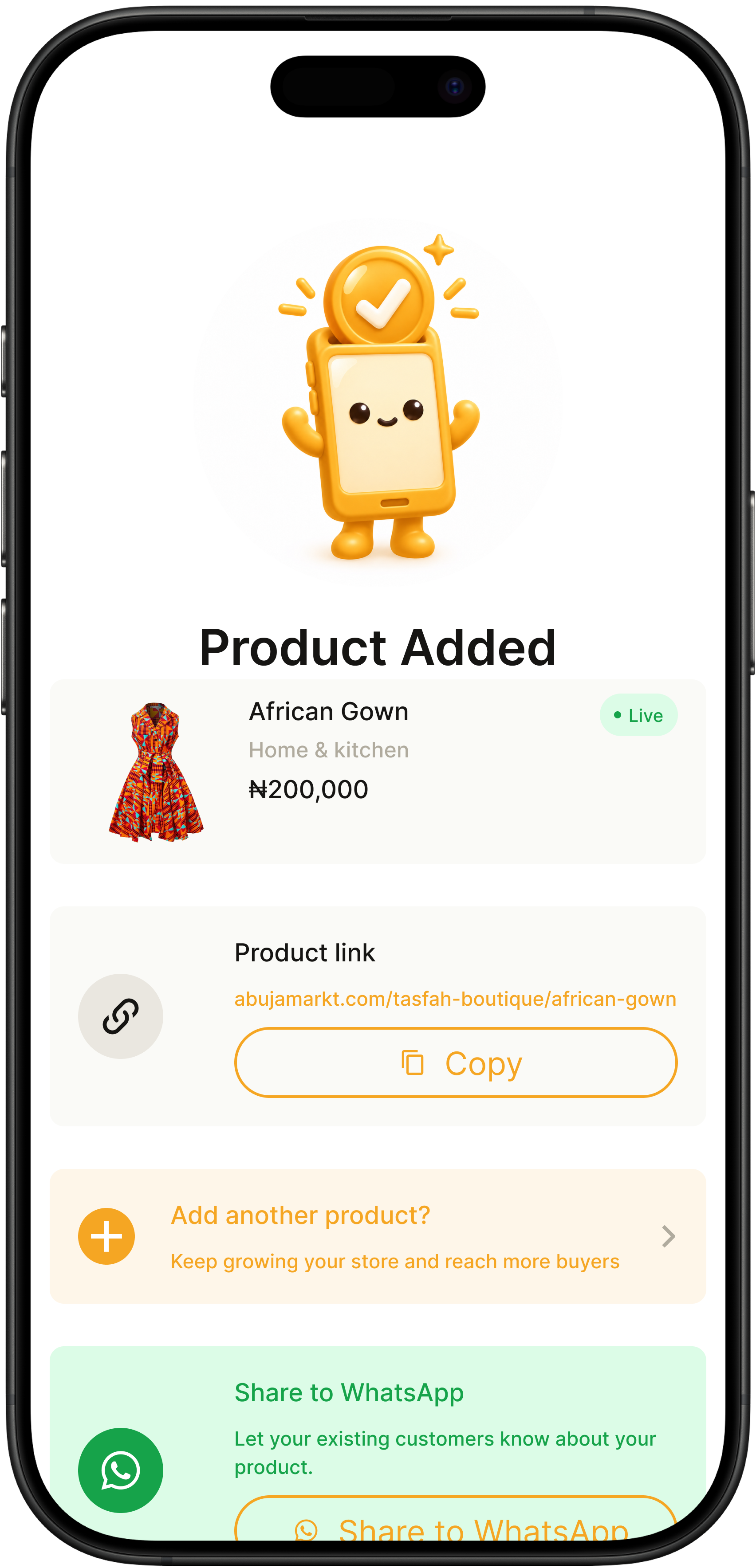
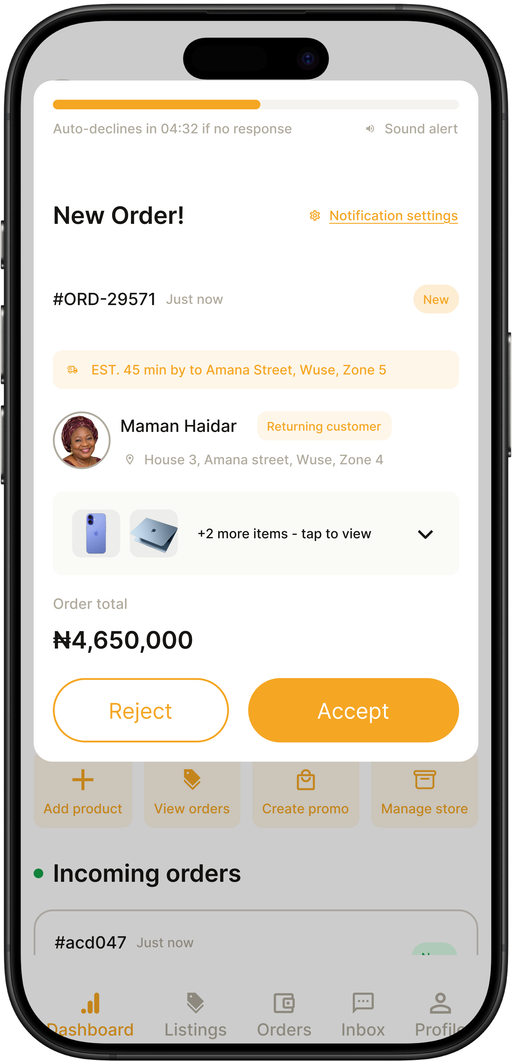
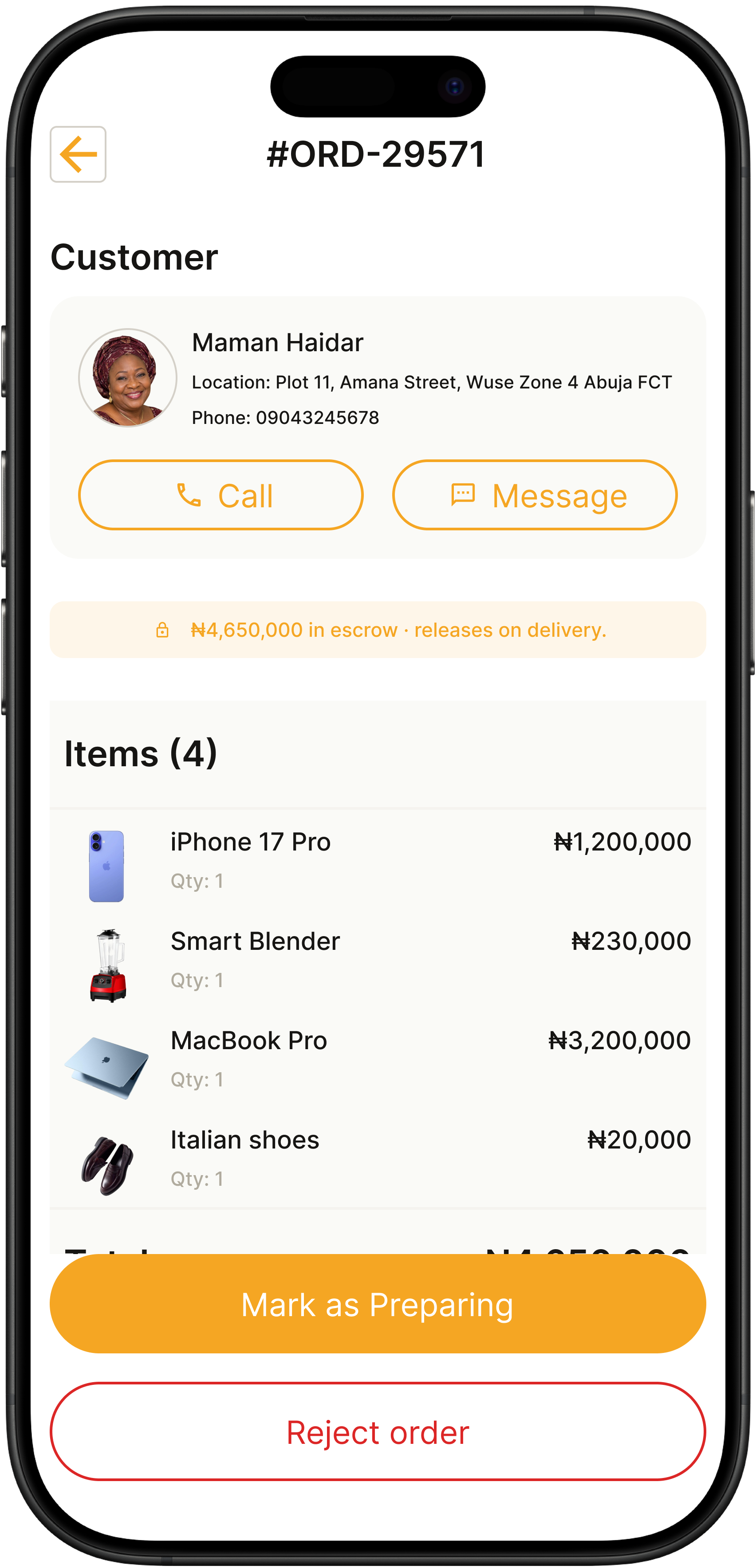
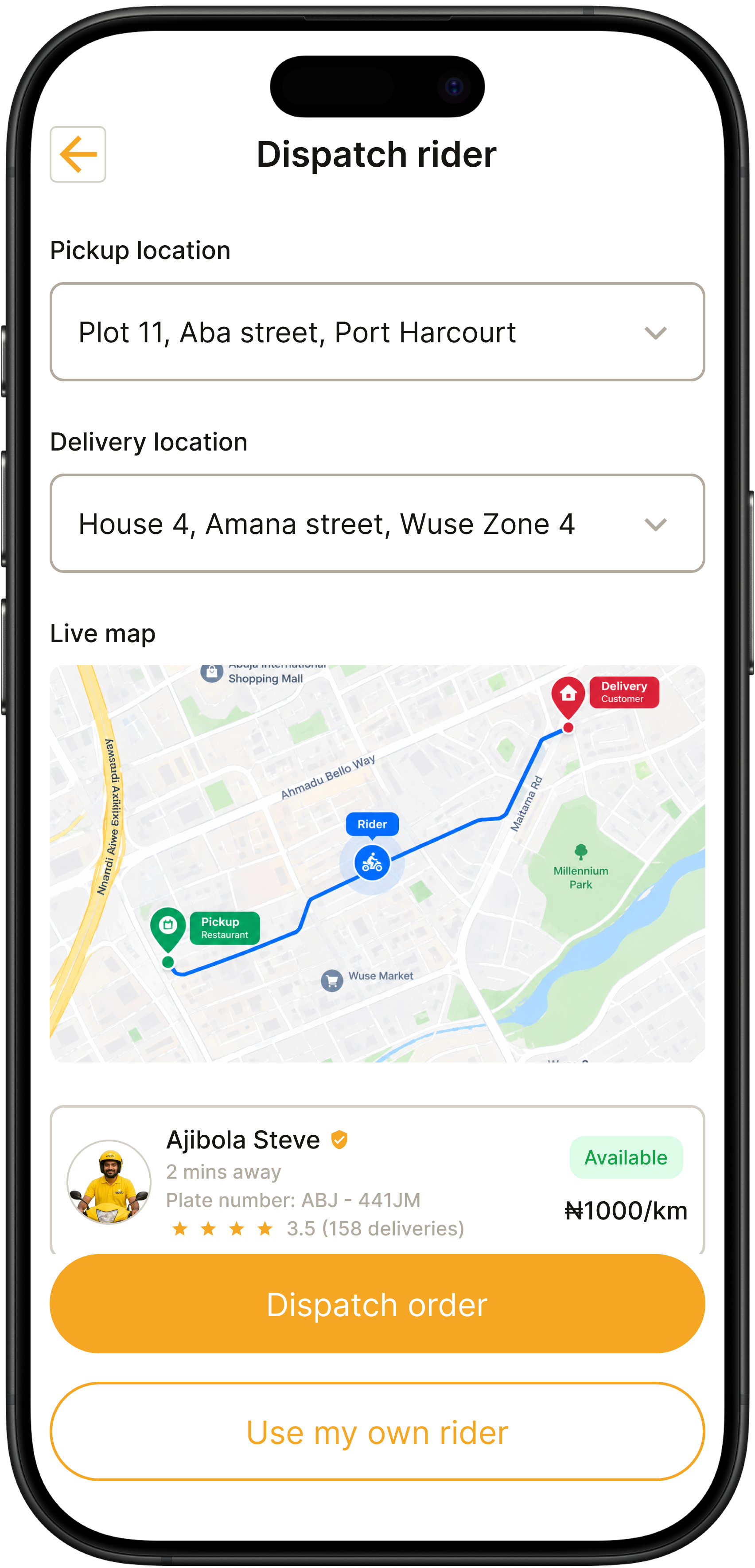
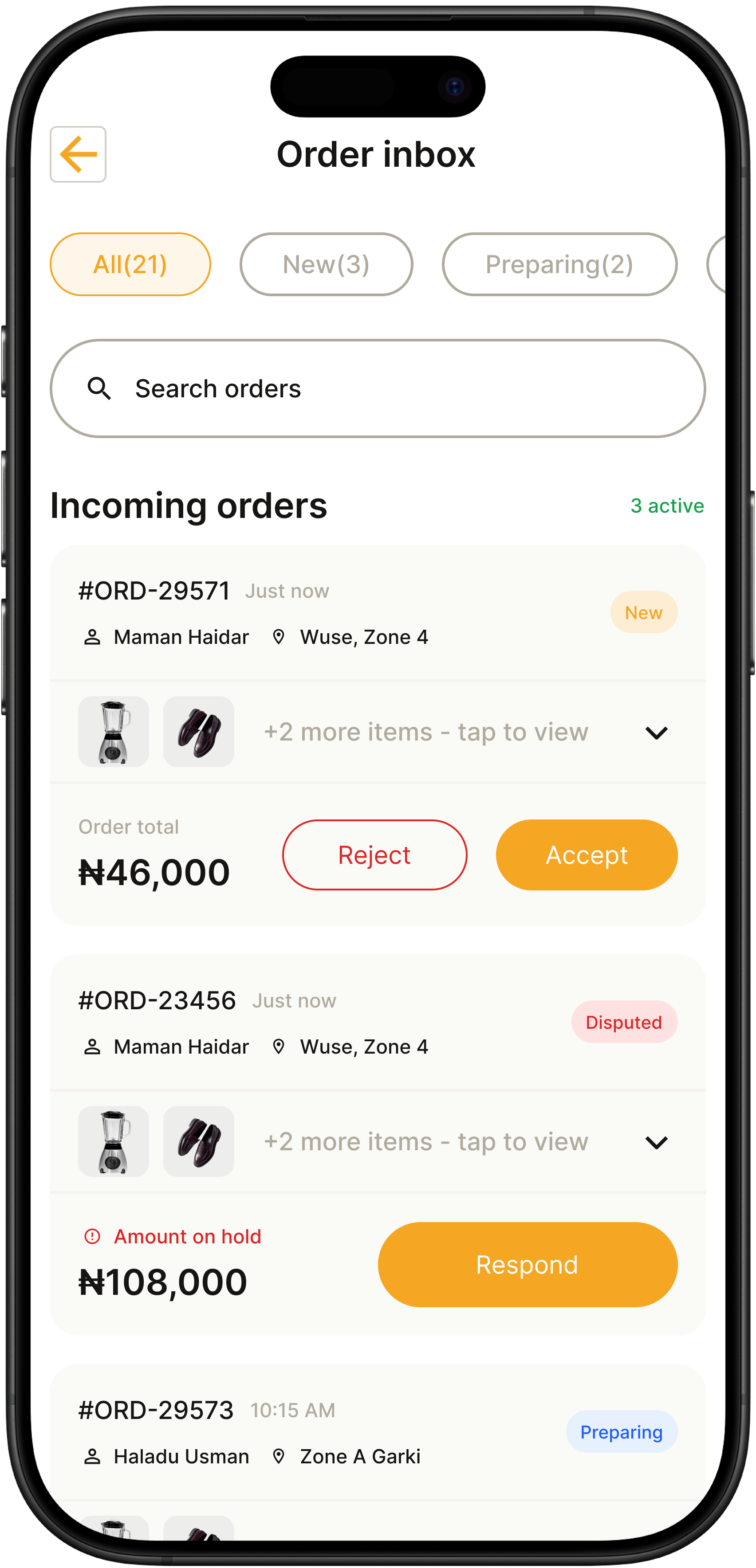
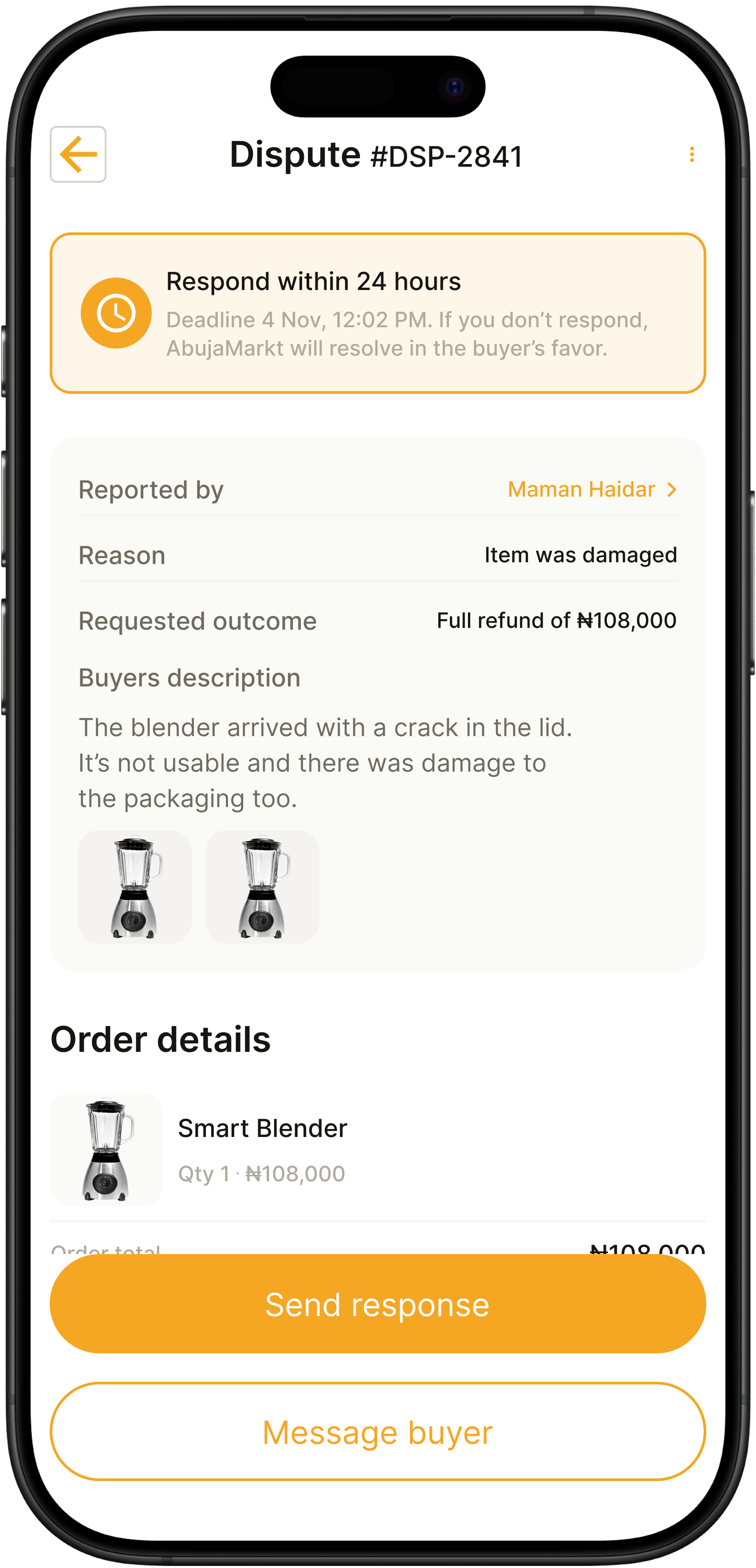
Escrow isn't a feature. It's the spine of the entire product.
Buyer Protection is easy to claim and hard to earn.
Every Nigerian marketplace says it protects buyers. Almost none actually do. Buyers have learned that "safe payments" is a marketing line. So the design challenge wasn't just explaining escrow — it was proving it.
Escrow is the spine, not a checkout badge.
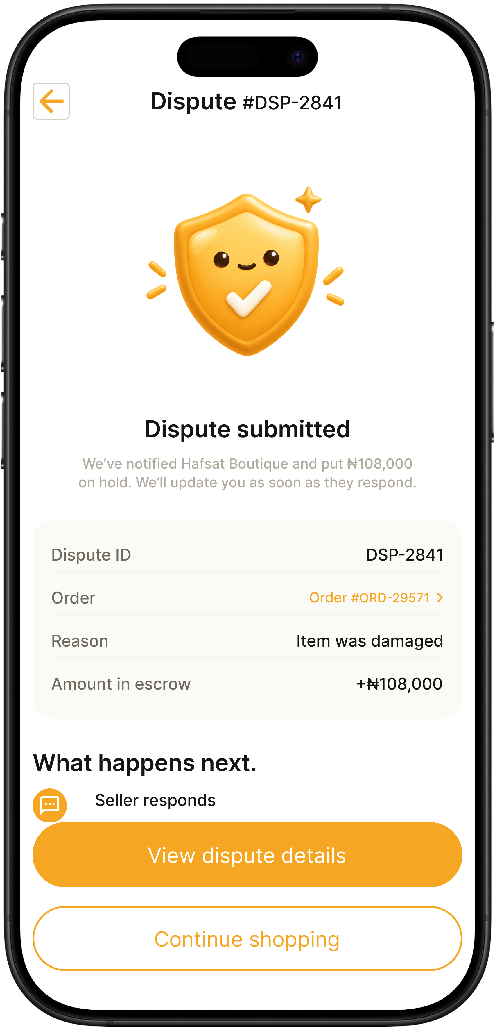
I made escrow visible on every screen where money is involved: checkout, order confirmation, order tracking, dispute flow, chat thread, wallet. Not as a sticker — as a system that visibly holds and releases money.
Why I rejected the "Buyer Protection badge" approach.
The obvious move was a single badge on the checkout screen. I tried it. It failed a simple test: if the badge only appears once, users assume it's a marketing claim, not a real mechanism.
Single "Buyer Protection" badge on checkout
Escrow visible on every money-touching screen
Trust is cumulative, not transactional.
If the app mentions escrow once and then disappears, users won't believe it. If they see it on every screen, it becomes the environment they're operating in. That's how escrow stops being a claim and starts being a foundation.
One thread per buyer — a controversial architecture decision.
WhatsApp fragments a relationship into a dozen chats.
A Nigerian seller doesn't have one conversation with a customer — they have many. Order question here, delivery follow-up there, product inquiry somewhere else. Nothing is threaded.
One persistent thread per buyer, with order context pinned inside.
Every buyer-seller relationship lives in a single thread. When a new order is placed, the order card is pinned at the top. Every status change appears as a system message in the same thread.
Why I rejected separate "order chat" and "general DM."
Separate channels felt cleaner on paper. But they fragment exactly what the seller is trying to remember: the buyer's history.
Separate order chat + general DM
One thread per buyer, order pinned
The thread becomes the relationship record.
Six months from now, when the same buyer messages again, the seller scrolls up and sees the whole history. WhatsApp can't do this. That's the whole point.
The public storefront is what WhatsApp can never provide.
On WhatsApp, a seller's identity is a phone number and a profile picture.
Buyers have no way to verify whether a seller has completed any orders, responds to messages, or delivers on time.
Give every seller a public, shareable, verifiable storefront.
Not a private profile — a public storefront with a verified badge, live stats, photo reviews, business hours, and a URL the seller can share on Instagram, TikTok, or packaging.
Why I rejected the private-profile shortcut.
Keeping stores private would have been faster to design and matched the WhatsApp mental model. But it would also have removed the single most important reason for a seller to switch.
Private seller profile (WhatsApp-like)
Public storefront with verifiable stats
WhatsApp can't give a seller a URL.
Hafsat can put her AbujaMarkt storefront link in her Instagram bio, her WhatsApp status, her TikTok, and on her packaging. Every share is a trust signal for the next buyer.
Error states are not edge cases. In Nigeria, they're the default.
Every app designed in Europe or America treats "no internet" as a rare failure. Here, it's Tuesday.
Weak connections, server timeouts, failed payments, incomplete data loads — these are the daily conditions of a huge portion of Nigerian users.
Design error states as a first-class family — same care as any success screen.
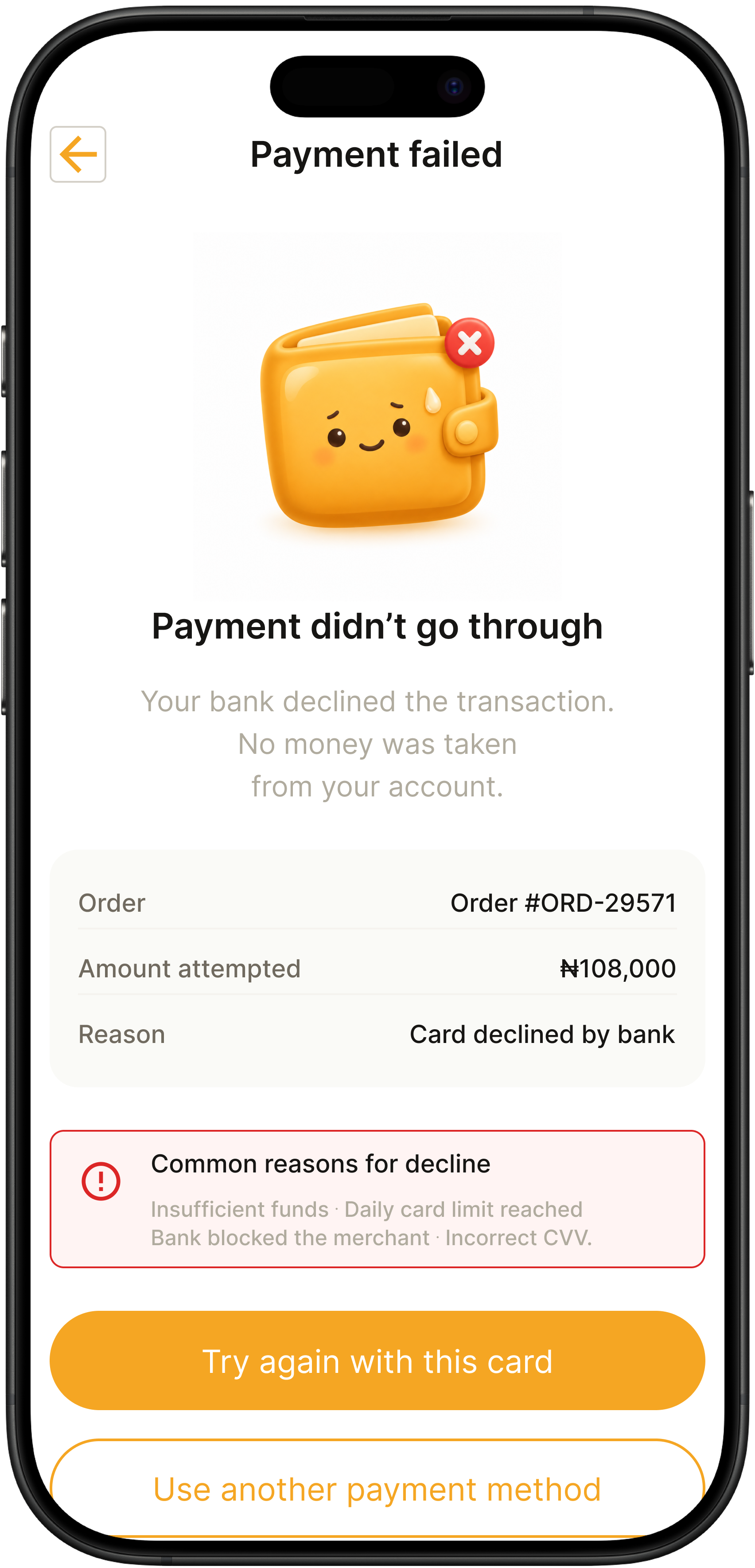
Ten illustrated states covering no internet, server errors, failed payments, weak connections, empty content across eight contexts.
Why I rejected a single generic "Something went wrong" screen.
A generic error screen is fast to design and easy to develop. But it wastes the highest-stakes moment in the entire app.
Single generic error screen
10-state illustrated error family
Error states are where the app's character shows.
Anyone can design a happy path. The offline screen that lets you browse saved items, the failed payment screen that reassures you no money was taken — that's the design that earns loyalty.
The wallet is a business tool, not a payment screen.
Sellers care about cash flow, not revenue.
"₦230,000 today" is a nice number. But it doesn't answer the question the seller actually asks: when do I get paid, and how much of it can I withdraw right now?
Available balance vs. pending escrow, side by side — always.
The wallet separates money the seller can withdraw today from money locked in escrow until delivery is confirmed.
Why I rejected the "balance + withdraw" pattern.
A simple balance + withdraw button is the standard fintech wallet. It's clean but it hides the most important information a Nigerian seller needs.
Single balance + withdraw button
Available + pending escrow, always visible
Money is the emotional core of the product.
Sellers won't switch from WhatsApp if the app doesn't make them feel more in control of their money.
Cancellation is an ethics problem disguised as a flow.
On WhatsApp, cancellation doesn't exist.
Once a Nigerian buyer pays via bank transfer, the money is gone. Cancellation is a chat asking for a favour — entirely at the seller's discretion.
Time-based rules that are symmetric and legible to both sides.
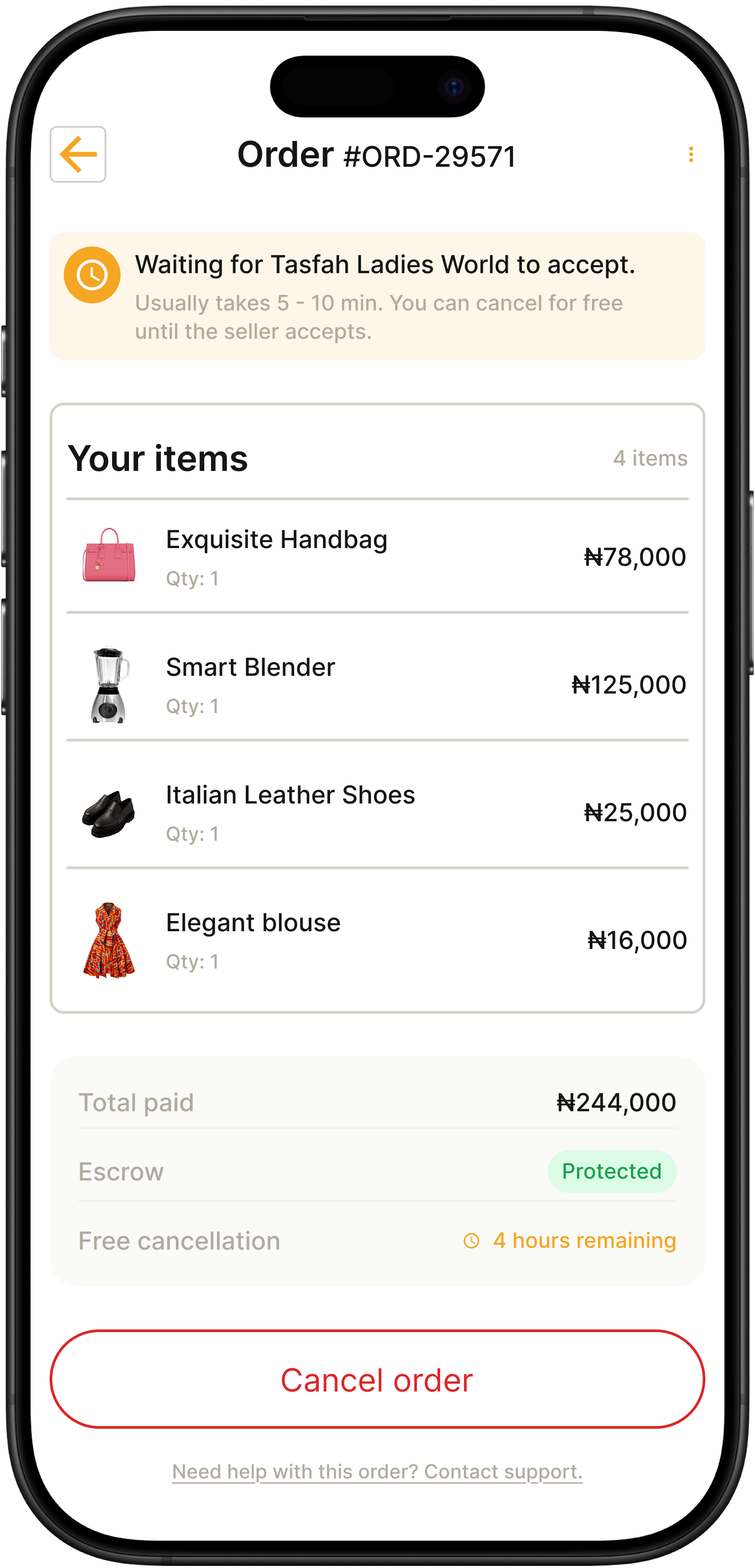
Free cancellation before the seller accepts. Mutual agreement after acceptance. Blocked once dispatched. Every cancellation ends in a system message in the thread.
Why I rejected a simple "cancel order" button.
A one-tap cancel is easy to design and easy to abuse. It would drive buyers away from sellers who can't fulfil orders and drive sellers away from a platform that punishes them.
Unconditional one-tap cancel
Time-based rules, symmetric to both sides
The rules are the product.
A buyer will accept a bad outcome if the process felt fair. A seller will accept a cancellation if the rules were clear. Cancellation isn't a support flow — it's the trust mechanism that underpins every other flow.
Why this work matters.
AbujaMarkt is in development, so I don't have usage metrics yet. What I can measure is what the design unlocks.
End-to-end flows designed
Across buyer and seller sides, each with happy paths, error states, and edge cases.
Unified design system
One component library, one illustration family, one brand voice — across two user types.
Trust mechanisms built in
Escrow, verified identities, one-thread-per-buyer chat, and formal dispute resolution.
WhatsApp behaviours removed
Voice notes, quick replies, image attachments, read receipts — all preserved.
The real impact isn't a number yet. It's that a Nigerian seller could put this app on their phone, spend an afternoon setting up their store, and — for the first time — have a business identity that doesn't live inside a chat thread. That's what I was designing for.
What designing this actually taught me.
Trust is a feature, not a feeling
I used to think trust was about polish. Working on AbujaMarkt taught me that trust is a mechanism — escrow, verification, timelines, dispute resolution. You have to build it, screen by screen.
Familiarity beats novelty every time
The biggest design temptation was to invent new interaction patterns to feel "innovative." The biggest win was copying WhatsApp's chat conventions precisely.
Error states are the highest-leverage screens in the app
I spent more hours on the offline state than on the home feed. And I'm convinced that was correct.
Data consistency is a design problem, not an engineering one
When an order total says ₦108,000 on one screen and ₦4,650,000 on another, users don't blame the backend — they blame the product.
Money screens deserve a different kind of care
Every screen where money is involved needed more copy, more verification, more reassurance than anywhere else.